Close menu
- Home
-
Children
- Back to parent navigation item
- Children
- CLIL
- Grammar
- Sustainable Development and Global Citizenship
- Support for Teaching Children
- Vocabulary & Phonics
- Warmers & Fillers
- Topics & Themes
- Teenagers
-
Adults
- Back to parent navigation item
- Adults
- Business and ESP
- ESOL
- Exams
- General English
- Grammar
- Skills
- Support for Teaching Adults
- Sustainable Development and Global Citizenship
- Vocabulary
- Professional Development
- Online Teaching
Macmillan Dictionary Blog
While the Macmillan Dictionary blog is no longer available, we have compiled a collection of dictionary-related resources from onestopenglish that you can use with your students.
Macmillan Dictionary BuzzWord: anecdata
This lesson plan by Kerry Maxwell gives tips and suggestions for using the BuzzWord article on anecdata in class.

Macmillan Dictionary BuzzWord: bitcoin
This lesson plan by Kerry Maxwell gives tips and suggestions for using the BuzzWord article on Bitcoin in class.
Macmillan Dictionary Quizzes: Blends
In this onestopenglish quiz, you can test your knowledge and practise guessing some of the most popular portmanteau words.
Macmillan Dictionary Quizzes: British or American Engish?
In these onestopenglish quizzes, you can test your speaking skills and practise distinguishing between British and American English words.
Macmillan Dictionary Quizzes: Commonly Confused Words
In this Macmillan Dictionary quiz, you can check your understanding of some commonly confused words in the English language.
Macmillan Dictionary Quizzes: Emoji
In this Macmillan Dictionary quiz, you can test your emoji reading skills and try to guess the titles of well-known books.
Vocabulary Infographics: 10 Idioms about books
Take a leaf out of our book and use this infographic to teach the top 10 book-related idioms.
Vocabulary Infographics: 10 Royal Idioms
Use this fun infographic to teach your students ten useful ‘royal’ idioms.
Vocabulary Infographics: 10 words to know when looking for a new job
Use this infographic to help your students succeed when finding a new job.
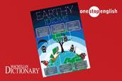
Vocabulary Infographics: Earthy Idioms
In honour of Earth Day, teach your students these Earth-themed expressions and phrases. They’re out of this world!
Macmillan Dictionary Blog: Metaphor
This article, by Dr Rosamund Moon, takes you through the fascinating world of metaphor and discovers how everyday words and phrases can have deeper, metaphorical meanings.
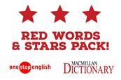
Macmillan Dictionary Red Words & Stars Pack
Learn about Red Words and how they can be utilized with the Macmillan Dictionary Red Words and Stars pack.
Join onestopenglish today
With more than 700,000 registered users in over 100 countries around the world, Onestopenglish is the number one resource site for English language teachers, providing access to thousands of resources, including lesson plans, worksheets, audio, video and flashcards.
Follow us and connect...
©Macmillan Education Limited 2023. Company number: 1755588 VAT number: 199440621
Site powered by Webvision Cloud